In today's visually driven digital world, the importance of aesthetics cannot be overstated.
Whether it's a website or a brand identity, the colours we choose play a significant role in shaping perceptions, provoking emotions and influencing user behaviour. This is where colour psychology comes into play. By understanding the impact of different colours on human psychology, designers can create websites and brands that effectively communicate their intended message and resonate with their target audience.
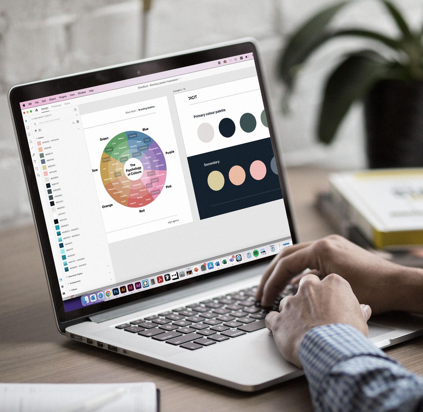
In this article, we uncover how colour psychology plays a huge role in designing websites and brands, and why we use it in our creative process at Digit.
- DIGITAL DESIGN
- ACCESSIBILITY
- BRAND DESIGN
The emotional influence of colours
Colour is one of the most powerful tools in a brand's toolbox. Studies show that up to 85% of customers base purchasing decisions on colour alone. Leveraging the psychology of colour in your branding is crucial for shaping customer perceptions and driving desired behaviours.
Colour elicits an emotional response. Our brains process colour before other visual details, triggering feelings that impact our actions. Red conjures passion, love, intensity or danger. Blue evokes calm, trust, or melancholy. While reactions vary slightly based on gender, culture, and past experiences, broad patterns exist.
For example the NHS or Paypal. What values do you associate with these brands? By strategically incorporating colours that align with the intended emotional response, designers can create a visually appealing and emotionally engaging experience for website visitors or brand consumers to help drive results.

Building brand identity
Colours are a crucial element in building brand identity. They have the power to convey a brand's personality and values, as well as helping to differentiate from competitors. For instance, vibrant and energetic colours like red or yellow may be suitable for a youth-oriented brand, while muted and sophisticated colours like black, grey, purple or navy blue can communicate professionalism and luxury. Consistency in colour usage across various brand touchpoints “ websites, logos, and marketing materials“ helps establish brand recognition and reinforce the brand image.
We recently worked on a new brand, app and website for Quartz Aero, the next generation of private air travel. Quartz needed to stand out with a bold brand that represented a quality product, so we created a monochrome palette injected with vibrant gradient colours, along with clever use of white space to draw the eye.

Enhancing user experience and navigation
Colours can significantly impact the user's experience of a website. By employing colours strategically, designers can guide users through the website and highlight important elements. For example, using contrasting colours for call-to-action buttons can draw attention and encourage user interaction.
A website's buttons make first impressions on users and guide them to key actions through strategic use of colour psychology - bright oranges grab attention for urgent "Buy Now" buttons while trusted blues like dark blue are ideal for "Confirm Purchase", green soothes users to welcome newsletter signups but should be avoided for financial transactions, creative brands play with energetic purples and feminine pinks but should avoid cliches, and subtle shade variations set different tones from soft and gentle pale hues to vivid, saturated colours that convey urgency and excitement, so thoughtful colour choices that reflect a brand's identity and steer users can significantly impact clicks and conversions through this simple but powerful design element. Take a look at the website we created for our long-standing client Clarity Environmental to see how an intelligent colour palette can bring a brand's values to life, and play a vital part in the user's journey throughout the site.

Accessibility and inclusivity
Colour psychology crucially intersects with accessibility and inclusivity considerations. Certain colour combinations may be challenging for individuals with visual impairments or colour blindness. Designers must choose colour palettes that offer sufficient contrast and legibility, allowing all users to access and engage with the content comfortably. Designing in this way will also ensure the website benefits from a Search Engine Optimisation (SEO) point of view. Google is very clear about accessibility playing a part in rankings and so, the easier your website is for all users to navigate and use, the higher it will rank in search results. A great example of an accessible website is our client Brighton and Hove Albion Foundation. We created clearly colour defined copy areas and elements to ensure the text is easy to read and the calls to action are clear.
In the world of web design and branding, colour psychology plays a pivotal role in capturing attention, evoking emotions and shaping perceptions. By understanding the psychological impact of different colours, designers can create visually appealing websites and brands that effectively communicate messages, build strong brand identities and ultimately do better business.
If you want to know more about how colour theory can get you results, contact us today.